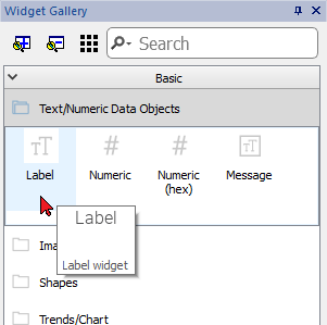
Label widget
The label widget gives the possibility to display text and tags values.
Path: View> Toolbars and Docking Windows> Widget Gallery
Label properties
Drag and drop the widget inside the page and select the widget to open the properties dialog of the widget.
Note that some properties are visible only when the "Show Advanced Properties" button is selected.
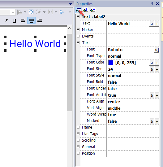
| Property | Description | ||||||||||||
|---|---|---|---|---|---|---|---|---|---|---|---|---|---|
| Text |
The string to display. String can be static or retrieved from a TAG. See "Attaching widget to tags " |
||||||||||||
| Marker | Enable a Marker around the widget (It is visible only inside JMobile Studio) | ||||||||||||
| Events | Action that will be executed if widget contents change. See "Events" | ||||||||||||
| Text | Text properties | ||||||||||||
| Frame | Parameters to enable and configure a frame of the widget and/or a color for the background | ||||||||||||
| Live Tags |
Enable to use tags values inside the text message. See "Live Tags"
|
||||||||||||
| Scrolling |
Parameters to enable and configure the scrolling of the text message
When the custom mode is selected, the below parameters can be defined:
|
||||||||||||
| General |
General properties
|
||||||||||||
| Position | The widget position on the display. See "Widget position on the display" |
Some properties have a couple of buttons:

|
Enter edit mode: you can directly type the tag name to use |

|
Attach to tag: |
A double clicks over the label widget will open the edit dialog box where you can enter the text to display and set the main text properties.
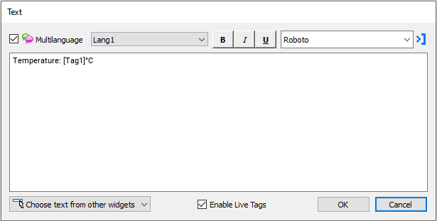
Live Tags
"Enable Live Tags" is enabled, text between square brackets are managed as tags place holders and will be rendered, from the runtime, using the tag value.
For example, the text label "Temperature: [Tag1] ºC" will be rendered as:
Temperature: 18 ºC
where "18" is the value contained inside Tag1
Tags
- [TagName]
The tag value is read and continuously updated
Use '\' before '[ ]' if you want to show the '[ ]' in the description string, for example: \[Tag\[1\]\] will display the string "[Tag[1]]".
Use '\', even when the tag label contains square brackets. For example, to display the live tag value of tag “TAG]3” or “TAG[3]” use:
- TAG\]3 = [TAG\]3]
- TAG\[3\] = [TAG\[3\]]
Array Tags
To reference the entire array (all elements will be shown):
- [TagName]
All array elements will be displayed using a comma separate list. - [TagName[-1]]
All array elements will be displayed using a comma separate list.
To reference an element of the array:
- [TagName.Index]
Example: [MyARRAY.5] will display the sixth element of the MyARRAY - [TagName[TagIndex]]
Example: [MyARRAY[TagIndex]] will display the sixth element of the MyARRAY when TagIndex is 5
Data Formats
Placeholder characters can be used to control how to display the tag value (see "Custom Formats")
- [TagName|format("###")]
Example:
Live: [fCounter|format("#.00")] - Triggered: [!fCounter|format("#.00")]
Note that by default, all tags are displayed as an integer. If you want to display a float number, you have to specify how to show the number adding the decimal digits.
Widget position on the display
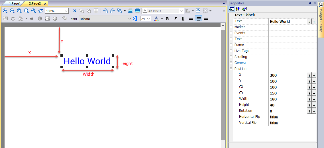
Rotation
To rotate a widget, click two times the widget. After the first click, the markers will become square, after the second click will become circles. Now click the mouse over a circle marker and drag and drop to rotate the widget. The rotation center is identified by the CX and CY parameters.
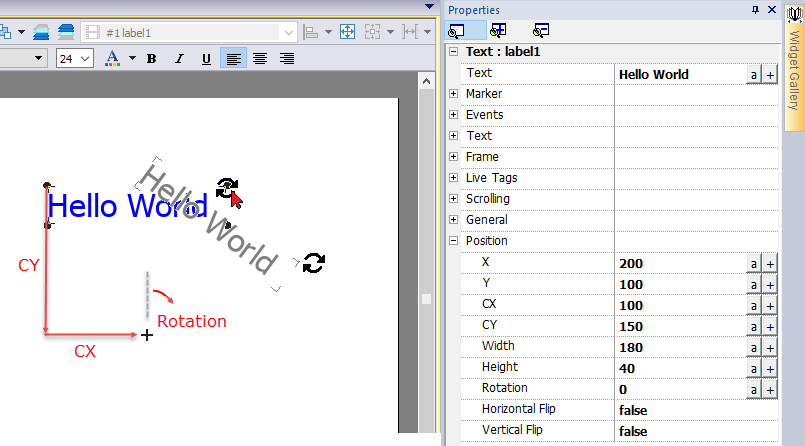
Note that all "Position" properties can be attached to tags and can be modified dynamically at runtime to move the widget.